
For years, purple had a bit of a reputation crisis in the interior design world. It was often relegated to royal palaces or teenage bedrooms, with very little middle ground.
But here is the truth I’ve learned after a decade of styling homes: purple is actually the most versatile, underutilized color in the designer’s toolkit. It is the ultimate shapeshifter.
If you are considering purple bedroom decor ideas, you aren’t just picking a color; you are choosing a mood. Unlike beige or grey, which sit passively in the background, purple interacts with a room. It changes based on the time of day, the season, and even the lamp you switch on at night.
Designing a purple bedroom isn’t about slapping paint on four walls. It’s about understanding balance. Let’s look at why this color works so well for sleeping spaces and how to identify the right approach for your home.
The Psychology of Purple in Personal Spaces
To understand why purple works, you have to look at its parents: red and blue.
Blue is universally calming, lowering blood pressure and heart rate. Red is stimulating and energetic. Purple sits right in the tension between the two. This makes it uniquely suited for a master suite or guest room.
In a bedroom context, purple offers the restorative properties of blue but with a touch of warmth that prevents the room from feeling “cold” or clinical.
- The Creative Retreat: Lighter, blue-leaning purples stimulate the imagination without causing anxiety. They are perfect for people who do their best thinking or reading before bed.
- The Sensory Cocoon: Deep, red-leaning purples create a sense of intimacy and enclosure. They visually shrink a room in the best way possible, making large, cavernous spaces feel safe and grounded.
When I walk into a well-designed purple bedroom, the immediate feeling should be a deep exhale. It signifies a space that is designed for rest, but not devoid of personality.
The Great Divide: Light vs. Dark Tones
The most common mistake homeowners make is treating all purple paint chips the same. The difference between a pale lavender and a deep aubergine is as vast as the difference between white and black.
Light Purple (The Airy Approach)
Light purples work by expanding space. They reflect light and blur the corners of a room, making small bedrooms feel significantly larger.
However, there is a fine line between “sophisticated airy retreat” and “children’s playroom.” The secret to keeping light purple grown-up is greyness. You want a color that looks purple when placed next to white, but might pass for grey when placed next to a vibrant color. We call these “complex neutrals.”
Dark Purple (The Moody Approach)
Dark purple is pure drama. It absorbs light, silencing the visual noise of a room.
I often recommend dark purple for bedrooms that don’t get much natural light. Instead of fighting the darkness with white paint (which can look dingy in shadows), embrace the shadows. A dark plum wall wraps around you. It feels expensive, intentional, and incredibly cozy.
Decoding the Popular Shades
Navigating the paint aisle can be overwhelming. Here is how I categorize the major players in purple bedroom decor, and where I typically use them.
Lavender
True lavender has a blue base. It is crisp, clean, and incredibly calming.
- Best for: Coastal homes, small guest rooms, or spaces with warm wood flooring (orange wood tones and blue-purple are complementary).
Lilac
Lilac has a pink base. It is warmer and sweeter than lavender.
- Best for: Romantic cottage styles or vintage-inspired spaces. It pairs beautifully with antique brass and soft floral patterns.
Dusty Purple (Mauve)
This is currently the darling of the design world. It is purple with a heavy dose of grey and brown. It feels organic and earthy, not synthetic.
- Best for: Modern, minimalist bedrooms. If you love the “Scandi” look but are bored of white walls, dusty purple is your answer.
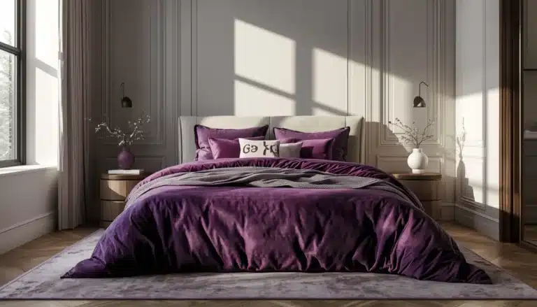
Plum & Eggplant
These are the heavyweights. Plum usually leans reddish-brown, while eggplant leans black-blue.
- Best for: Accent walls behind a headboard or a library-style bedroom. These shades demand good lighting and metallic accents to keep them from feeling flat.
The Critical Role of Lighting
You cannot choose a purple paint color in the store. You just can’t. Purple is the color most susceptible to metamerism—the phenomenon where a color looks completely different under different light sources.
Natural Light Direction
- North-Facing Rooms: The light coming in is cool and blue. If you put a blue-based lavender here, the room will feel icy and uninviting. You need a warmer plum or lilac to counteract the cool light.
- South-Facing Rooms: These get warm, golden light. You can get away with cooler, greyer purples here, as the sun will naturally warm them up.
Artificial Lighting (Kelvin Temperature)
Your lightbulbs will make or break your purple decor.
- Soft White (2700K): Casts a yellow glow. This will turn lavender into a muddy grey and make eggplant look brown.
- Daylight (5000K): Casts a blue glow. This makes purple look very vivid, almost neon, which is rarely what we want in a bedroom.
- The Sweet Spot (3000K – 3500K): This is usually the target. It renders the purple true to color without muddying it or making it electric.
I always tell clients: paint a large sample board (at least 2 feet by 2 feet) and move it around the room for 24 hours. Watch how the purple changes from morning coffee to bedtime reading.
Building the Look Layer by Layer
Now that we have established the foundation of color theory, we need to talk about execution. A paint chip is not a room. The magic of a purple bedroom happens in the layering—how the textiles meet the walls, and how the light hits the floor.
Here is how to bring purple into every element of the room without it looking like a theme park.
Styling Purple by Element
Walls and Paint Accents
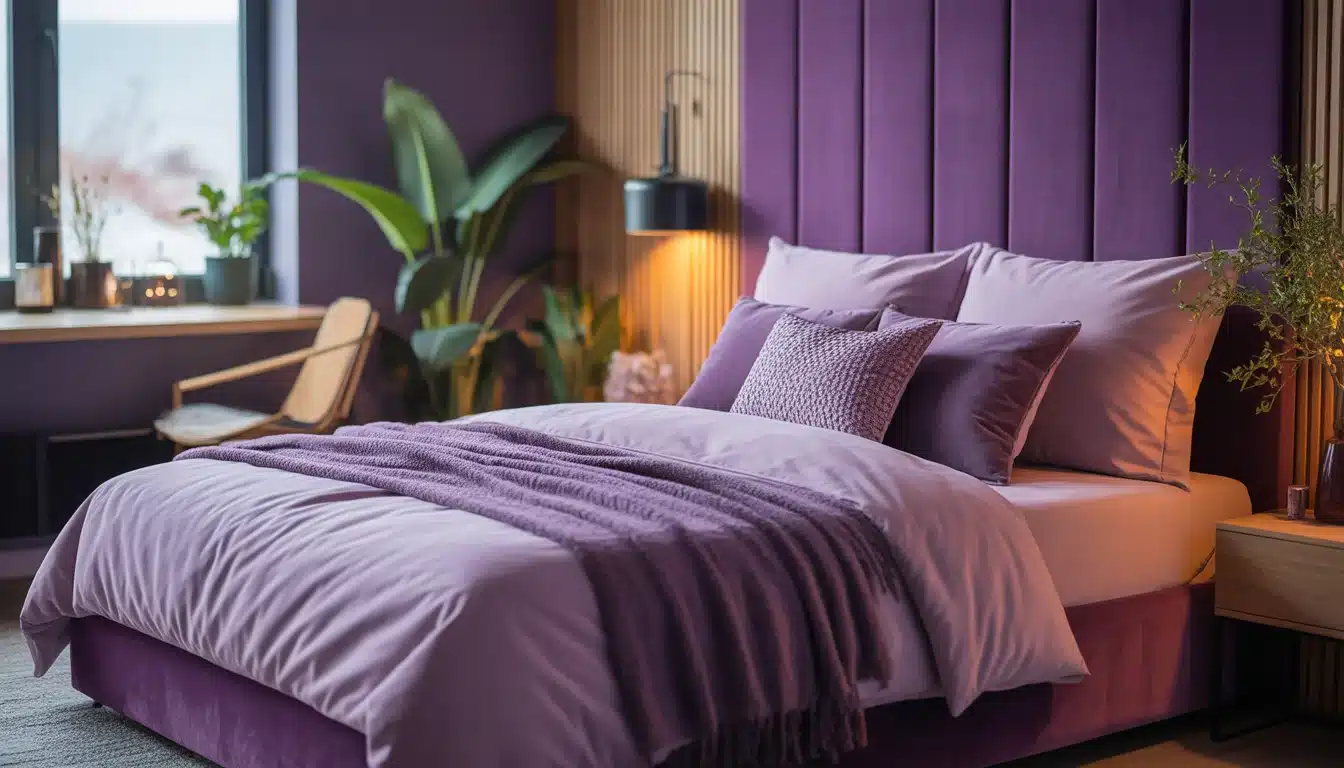
If you are committing to purple walls, the finish matters just as much as the color. For dark shades like eggplant or royal purple, I almost always recommend a matte or flat finish. High gloss on dark walls can create harsh reflections that ruin the cozy “cocoon” effect. Matte finishes absorb the light and make the color feel velvety and rich.
If painting the entire room feels too intense, consider the “headboard wall” approach. Paint the wall behind your bed in a deep plum, and keep the other three walls a soft, warm white or a very pale grey that carries the same undertone. This anchors the bed and creates a focal point without darkening the whole space.
Bedding and Textiles
The golden rule for purple bedding: Texture over color matching. Please, do not buy a “bed-in-a-bag” set where the comforter matches the curtains. That flattens the design. Instead, mix your purples through texture.
- Linen: A washed linen duvet in dusty lilac feels relaxed and lived-in.
- Velvet: A couple of deep plum velvet throw pillows adds instant luxury and catches the light beautifully.
- Knits: A chunky knit throw in a heathered purple adds warmth to the foot of the bed.
I often prefer keeping the main duvet white or oatmeal and using purple only for the “accessory” layers—the throw blanket, the euro shams, and the bolster pillow.
Curtains and Window Styling
Your window treatments are an opportunity to frame the view. In a purple room, you have two strong options:
- Tone-on-Tone: Choose curtains that are one shade darker or lighter than your wall color. This creates a seamless, high-end hotel look that makes ceilings feel higher because the eye doesn’t stop at the window.
- Crisp Contrast: If you have dusty purple walls, crisp white linen curtains are breathtaking. They break up the color and keep the room feeling airy.
Rugs and Floor Accents
Purple is a strong color, so the floor needs to ground it. If you have purple on the walls or bed, avoid a purple rug. It’s too much. Instead, look for vintage-style Persian or Turkish runners that have hints of plum or wine woven into them, but are primarily beige, rust, or navy. This ties the room together subtly. For a modern look, a cream wool rug with a high pile provides a soft, neutral base that lets the purple elements shine.
Lamps and Lighting Fixtures
Lighting fixtures are the jewelry of the room.
- Brass and Gold: These warm metals look incredible against purple. They bring out the red undertones and add a regal touch.
- Matte Black: For a modern, industrial edge, black fixtures against a lavender wall look sharp and graphic.
- Glass and Crystal: If you want a feminine, airy feel, clear glass lamps keep the visual weight light.
Wall Art and Accessories
Art is the bridge between your purple decor and the rest of the room. Look for prints or paintings that contain your specific shade of purple but aren’t only purple. A landscape with a lavender sky, or an abstract piece with plum strokes, helps justify the wall color. Pro Tip: Use the “60-30-10” rule for accessories. 60% neutral, 30% purple, and 10% of a third accent color (like mustard yellow or sage green) to keep the eye moving.
Styling by Room Type
Small Bedrooms
In a small bedroom, you might fear that purple will make it feel claustrophobic. The opposite is true if you use the “color drenching” technique. Paint the walls, the trim, and even the door in the same shade of mid-tone purple. This hides the boundaries of the room, making it feel infinite rather than boxy. Keep the furniture low-profile and the bedding light to maintain balance.
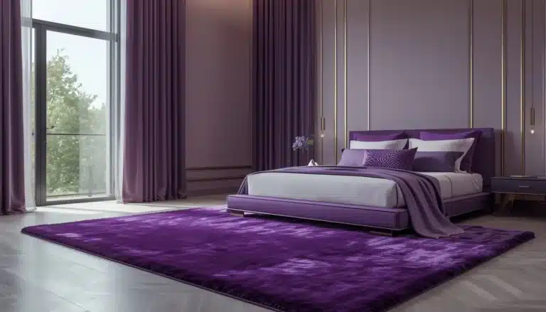
Master Bedrooms
This is where you can go bold with deep, dramatic shades like fig or aubergine. The master bedroom is usually used mostly at night, so you want a color that looks good in low light. Layering is key here: an upholstered headboard, heavy drapes, and a plush rug. You want the room to feel soundproofed and soft.
Guest Bedrooms
For guest rooms, I lean towards the crowd-pleasers: lilac or sage-toned mauve. These colors are gender-neutral and relaxing. They feel like a boutique hotel. Pair these shades with crisp white hotel bedding and natural wood furniture to ensure the room feels fresh and clean for your guests.
Apartment Bedrooms (Rental Friendly)
If you can’t paint, bring purple in through the “big three”: Headboard, Rug, Curtains. A freestanding velvet headboard in deep plum can transform a white-walled rental instantly. Pair it with floor-to-ceiling purple curtains (hung high and wide) to cover boring walls. This gives you the impact of color without losing your security deposit.
Winning Color Combinations
Purple plays well with others, but it’s picky about its partners.
Purple and White
This is the freshest combination. It feels clean, crisp, and revitalizing.
- The Vibe: Springtime, airy, spa-like.
- How to do it: Lavender walls with bright white trim and bedding.
Purple and Grey
A sophisticated, moody pairing. The key here is matching the undertones.
- The Vibe: Modern, masculine, understated.
- How to do it: Cool blue-purple pairs with cool steel grey. Warm plum pairs with warm “greige.”
Purple and Beige / Cream
This is much warmer and more inviting than purple and white.
- The Vibe: Cozy, traditional, soft.
- How to do it: Deep eggplant walls with creamy oatmeal bedding and linen lampshades. The cream cuts the harshness of the dark color.
Purple and Gold / Brass
The ultimate luxury pairing. Purple has a history of royalty for a reason.
- The Vibe: Glamorous, regal, vintage.
- How to do it: Don’t overdo it. Just a brass curtain rod, a gold frame on the mirror, and maybe a brass lamp base.
Purple and Natural Wood
This is my secret weapon for making purple feel grounded and organic, rather than artificial.
- The Vibe: Earthy, bohemian, eclectic.
- How to do it: Walnut or dark oak wood looks stunning against light lavender. Lighter oak or birch wood pops beautifully against dark plum. The wood grain adds a natural texture that flat paint lacks.
Refining the Vision and Avoiding Pitfalls
We have covered the psychology, the specific shades, and the styling of individual elements. But the difference between a room that feels “designed” and one that feels “cluttered” often comes down to editing.
When working with a color as strong as purple, restraint is your best friend. Here is how to polish the look and avoid the most common styling traps.
The Art of Balance: Accent vs. Dominant
You don’t need to paint every wall eggplant to have a purple bedroom. In fact, some of the most successful designs I’ve worked on use purple sparingly.
The “Hint of Tint” Approach (Accent)
If you are nervous about committing, treat purple as a spice, not the main course. Keep your walls neutral—warm white, soft grey, or beige. Then, introduce purple solely through:
- One statement piece: A velvet armchair in the corner or an upholstered headboard.
- The “soft” layer: Throw pillows and a folded duvet at the foot of the bed.
- Artwork: A large print that features purple tones.
This allows you to change the vibe of the room seasonally without repainting.
The “All-In” Approach (Dominant)
If you love the immersive feeling of color, go for it, but use the monochromatic rule. If your walls are dark plum, don’t use the exact same shade for your bedding. Go lighter (lavender sheets) or darker (almost black curtains). Monochromatic layering creates depth; matching everything perfectly creates flatness.
Texture: The Secret Weapon
I mentioned texture briefly in the bedding section, but it deserves its own moment. Purple, especially in darker shades, can look very “heavy” or “flat” if the materials are wrong.
- Avoid: Cheap, shiny synthetics. Satin or low-quality polyester in purple tends to look like a costume.
- Embrace: Light-absorbing and organic materials.
- Matte Velvet: Absorbs light and makes the color look deep and expensive.
- Raw Linen: The natural weave breaks up the color, making even bright lilacs feel earthy.
- Woven Wool: Adds necessary coziness.
Common Purple Decor Mistakes to Avoid
In my years of consulting, I’ve seen a few recurring issues when homeowners try this color.
- The “Barney” Effect: Using a purple that is too saturated and primary. Avoid “crayon purple.” Always look for shades with grey, brown, or blue undertones to ground them.
- Ignoring the Ceiling: If you paint your walls a rich, dark aubergine but leave the ceiling stark bright white, the contrast can be jarring. It kills the mood. Consider painting the ceiling a soft grey or even wrapping the wall color up onto the ceiling for a cozy, jewel-box effect.
- The Theme Room: Trying to force a specific theme (like “Provence” or “Royal”) too hard. A dried lavender pot is fine; a room full of lavender print wallpaper, lavender sachets, and purple furniture is too much. Let the color speak for itself without the props.
Where to Go From Here
Purple is a journey. You might start with a few lilac throw pillows and find yourself painting the walls plum a year later. As you refine your style, you might want to explore specific aesthetics more deeply.
We are currently compiling deep-dive guides on specific purple niches, including Boho-Chic Purple Bedroom Styling for those who love plants and rattan, and Modern Minimalist Lavender for fans of clean lines and Scandinavian design. These styles take the foundational rules we’ve discussed here and apply them to specific furniture shapes and era-specific decor.
Final Thoughts: Trust Your Instincts
Designing a bedroom is personal. It is the last thing you see before you sleep and the first thing you see when you wake up.
Don’t let the fear of a “bold” color scare you away from purple. Whether you choose a whisper-soft lavender to greet the morning sun or a deep, moody fig to wrap you up at night, the goal is the same: a space that feels like you.
Start small. Buy a sample pot. Paint a large card. Live with it for a week. You might just find that purple provides the sanctuary you didn’t know you needed.
Frequently Asked Questions About Purple Bedroom Decor ideas
Is purple actually a good color for a bedroom?
Absolutely. In the world of color psychology, purple is one of the few colors that successfully balances the calmness of blue with the warmth of red. This makes it an ideal “restorative” color. It feels more intimate than a standard blue but more relaxing than a warm pink or red, creating a perfect middle ground for a space meant for unwinding.
Which shade of purple is best for a restful sleep?
If sleep quality is your priority, look for “muted” or “dusty” shades. Lavender and mauve are perennial favorites because they have a high grey content, which prevents the color from feeling too stimulating. Very bright, “grape” purples can actually be a bit too energetic for a sleeping area, so I always recommend leaning toward the cooler, softer side of the spectrum.
Can I use purple in a very small bedroom?
Yes, and it can actually be a design advantage. Many people fear dark colors in small rooms, but a deep plum or eggplant can create a “jewel box” effect that makes the walls seem to recede, adding depth. If you prefer a lighter look, a pale lilac can make a small room feel airy and open, much like a soft white would, but with more personality.
How do I decorate with purple without it feeling overwhelming?
The secret is the 60-30-10 rule. Let a neutral color like cream or soft grey take up 60% of the room, use purple for 30% (perhaps on the bedding and curtains), and use a third accent color for the final 10%. By treating purple as a significant accent rather than a total flood of color, you maintain a sophisticated balance.
What are the most foolproof colors to pair with purple?
For a crisp, modern look, you can’t beat purple and white. If you want something more grounded and “grown-up,” try pairing plum with warm wood tones and brass accents. For a moody, contemporary vibe, charcoal grey and deep purple are a stunning combination. If you want a bit of a designer edge, a soft sage green is the perfect “complementary” partner for lavender.
Does purple decor work in a modern, minimalist home?
It does, provided you choose the right tone. Modern minimalism thrives on “dusty” purples—shades that look almost like a warm grey in certain lights. When you pair a matte mauve wall with clean-lined furniture and natural textures like jute or linen, the result is a space that feels contemporary and warm rather than dated or overly traditional.
How do I keep a purple bedroom from looking too "juvenile"?
This is the most common concern I hear. To keep the space feeling mature, avoid high-gloss finishes and overly “sweet” pastel purples. Instead, look for purples with “muddy” undertones (browns, greys, or blacks). Combining these sophisticated shades with high-end textures like velvet, dark woods, and metallic finishes will ensure the room feels like an adult sanctuary.
Muhammad Shahzad is a home décor and lifestyle content specialist who focuses on color-themed product research and buyer-focused reviews. He creates user-first content by analyzing product quality, real-world usability, design appeal, and value for money—helping readers make confident purchase decisions. His work emphasizes clear comparisons, practical guidance, and honest recommendations tailored for U.S. online shoppers.

3 Comments
Comments are closed.